Recently James from Loopy Meals informed me of the launch of Malaysia’s First Online Bulk Discount Store; Tumpang.com. Being an avid bulk buyer in Low Yat Forums (LYN) and soon to be seller, the addition of Tumpang has added yet another channel for me to sell stuff online with confidence.
To be honest, Tumpang’s order in bulk and get a large discount concept is not totally new to me since I’m one of those Internet junkies who hang online often especially at the LYN Bulk Orders. Both Tumpang and the LYN Bulk Orders are almost identical of concept while some would debate on it’s the same. However, I believe the only big difference is Tumpang stands alone and removes the dodgy atmosphere I’ve heard a friend say after showing him the LYN Bulk Orders.
Now that you know what Tumpang does and how it could drive your sales up, let’s get down to the detail and review of things. I’m Danny Foo, a Malaysia web designer who design websites not for mere aesthetic value but for purpose, business and its users.
 Let’s start this of with something really major, the domain name. As you know, there are hardworking users who type full website addresses; www.your-name.com and the lazy ones (me, sometimes) who like to type your-name.com. That said, Tumpang has a domain name problem when users become lazy and type tumpang.com
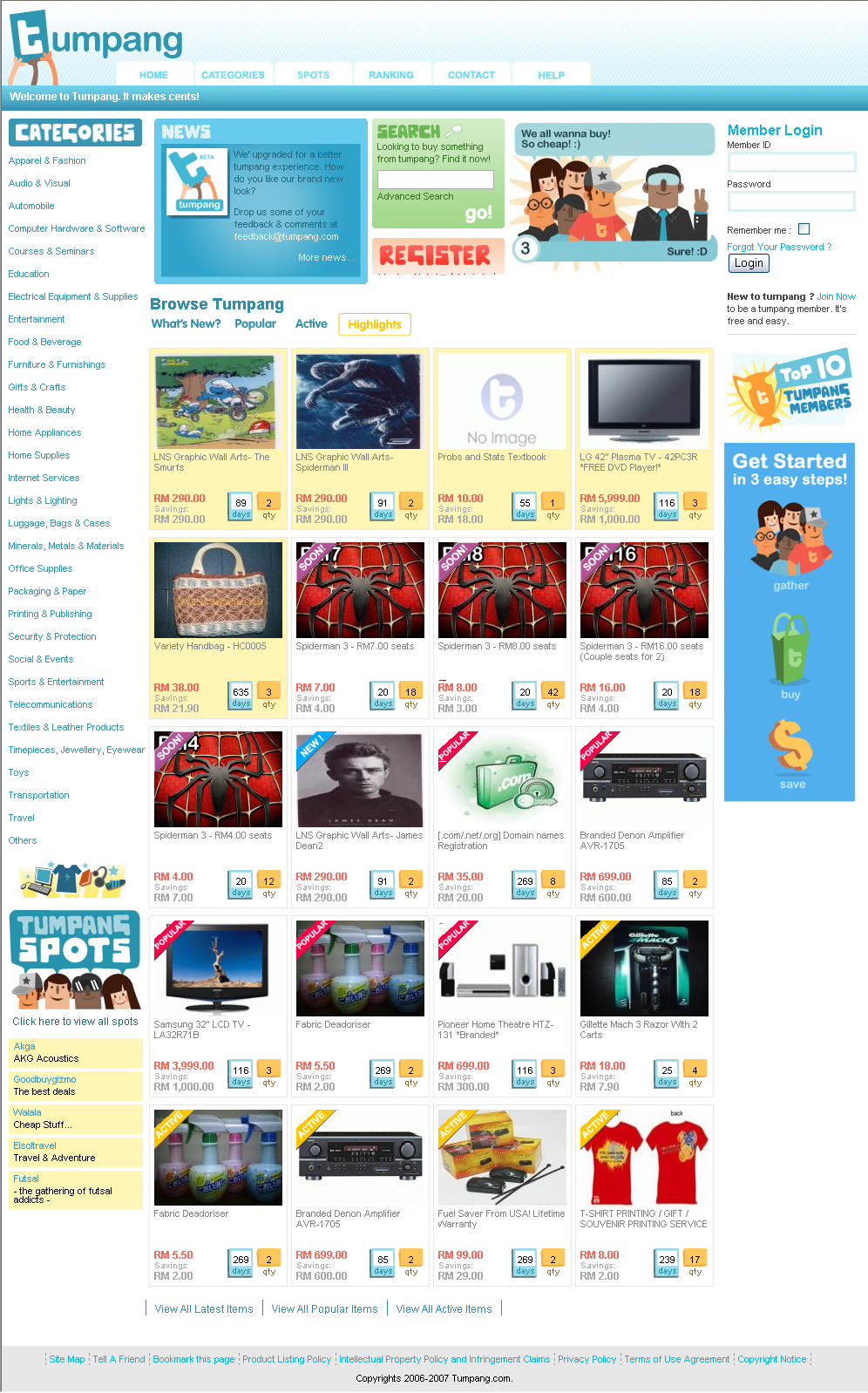
Besides domain names, I like to start my reviews with an overall user experience check. For Tumpang, the environment is not only friendly but you can also feel a playful vibe. Judging by the interface and overall layout, I would say Tumpang is targeting the young IT-savvy market. Here’s something I hope Tumpang will fix in order to reach a broader market; increase of text size. At the moment, the default size is smaller than what I would recommend. I’ve also found certain redundancies which I’ll tell you about as we move on.
The homepage is the most important page of your website because it’s where your users decide if your website is beneficial to their time and if they’re in business, their money. First impressions of Tumpang was pleasant being greeted by cool hues and playful typefaces. However, I think the cool hues went a little overboard as certain lighter blue text are not easily scannable. For instance, the main tabs above are almost clashing with the white.
The other discovery made through this review is the fixed categories on the left side isn’t consistent on all browsers. The lines are actually distributed well in Internet Explorer but for modern browsers like Mozilla Firefox and Opera it’s all stuck closely together. Probably a CSS tweak might fix this quickly. I love web standards! :D And at the moment, I’m still using Internet Explorer 6 and trying to resist installing version 7.
Since I was discussing about certain areas having poor contrast in colors, I should mention the News panel is suffering this very very badly. I hope the Tumpang team can fix this quick.
I’m having some confusion defining the difference between Popular and Active. Can a person be Active but not Popular? Can a person’s item be Popular but not Active? Do you get it? In addition to that, what is Highlights?
Wow! Wow! and Wow! I’ve made a discovery that the Tumpang website is really built to be liquid. Try to restore the browser size and start stretching it sideways. You will notice that the content in the middle column stretches fluidly like liquid. It doesn’t elongate but just fills the space. For a moment there, I was thinking the priority listing or selected items in yellow boxes were almost doomed.
So that’s all the good news, now is the bad news. The homepage in my opinion is overly cluttered. There are too many things around and it’s affecting the focus factor of the website. The concept is there but it’s hidden in all the items and elements which will not explain what is Tumpang to first time users. It might not sound bad because it’s in one paragraph but trust me, if first time users can’t understand how easy it is to use Tumpang then 80% of business is lost.
Moving forward, when I’m in the Categories page I noticed a search repetition. There is one in the left sidebar and one in the main area. Which is it am I suppose to use? And how come the list of categories in the sidebar is more than the main area? Here’s a suggestion to the Tumpang team. Instead of using the search or repetition of categories again, why not use a social tagging solution and remove the search on the left when users navigate to the category page.
Jumping next into the Spots page. Could someone who is not on Tumpang please tell me what is Spots all about? Who is it for? How do I qualify for a Spot? Simple questions left unanswered when you’re in the page and guess what, you will reach no goal being in there – or not yet, at least. The other thing I noticed is the unnecessary image in the bottom left corner. Don’t get me wrong, the image is cute but I think it’s positioned wrong. My advise, answer the questions in a short description and place the image in the content. Problem solved for the time being.
Surfing into the next page; Ranking, is a great activity driver. It’s self-explanatory and who knows, maybe Tumpang will be having a contest later. Hint-hint. :P Oh yeah, after logging in (I registered to do this review) are the rankings suppose to be displayed as well? Because now it’s blank.
The one page I have absolutely no knick or advices to give is the contact page. It’s a simple form to send a support or enquiry and the best part, if you’re a member then some of the fields are populated for you which is great as you spend less time when making a submission.
Finally, last but not least is the Help area. The biggest advice I’d like to give here is to please reconsider the naming convention. Help could be misinterpreted as Support that might then lead to the resemblance to Contact. I hope you were following me there. As much a young IT-savvy person I might be, I’m honestly feeling agitated with long durations of reading the small text. While I’m recalibrating my eyesight, why does the FAQ speak of a Tumpang toolbar as I can’t find it anywhere?
Well, that’s the end of my hefty, nitty-gritty, detailed, straight forward, honest review of the Tumpang.com website. All references and opinions made above is my personal professional opinion as a web designer without any intention to defame or discredit the business of Tumpang.com, its team or its members.
If you guys would like to know more about how to improve a web design in terms of usability, you can find me at Simpleet Solutions.
frankly, I do not know what is it about when someone shows me the website. It should have big clear instruction on the homepage for beginner.
Thanks for the great review and the honest feedbacks! I agree with you in some of the areas and we definitely need to improve. One of the biggest challenge we face now is to educate the users and I think bloggers can do a fantastic job in that. The idea is new to those who hasn’t done bulk buy, I will try my best to explain all about it in our blog! Cheers.
Liew, that’s one the things I highlighted as well. Thanks for coming by.
Well, that really depends who you really would like to aim for Jef. Even young IT-savvy users are becoming a little more demanding today. :)
p/s: Thanks for following up.
Cheers.