![]() Heartbeat is a Malaysia online shop for personalized gifts aimed at customers who want a present more than ordinary. This is a requested website review by one of the Heartbeat founders; Vincent. When he got in touch with me, he already informed me there were other bloggers who’ve written about Heartbeat. However, I personally found the write-ups as not much a review but like a featured post.
Heartbeat is a Malaysia online shop for personalized gifts aimed at customers who want a present more than ordinary. This is a requested website review by one of the Heartbeat founders; Vincent. When he got in touch with me, he already informed me there were other bloggers who’ve written about Heartbeat. However, I personally found the write-ups as not much a review but like a featured post.
Therefore, I pre-informed Vincent if he wants me to review his website it will be a review and not a write-up. It will be criticized for its strengths and weaknesses like the Tumpang website review. And Vincent was actually surprised when I told him because he thought the other write-ups were reviews. Well, Vincent…this is what I believe is a website review for Heartbeat.
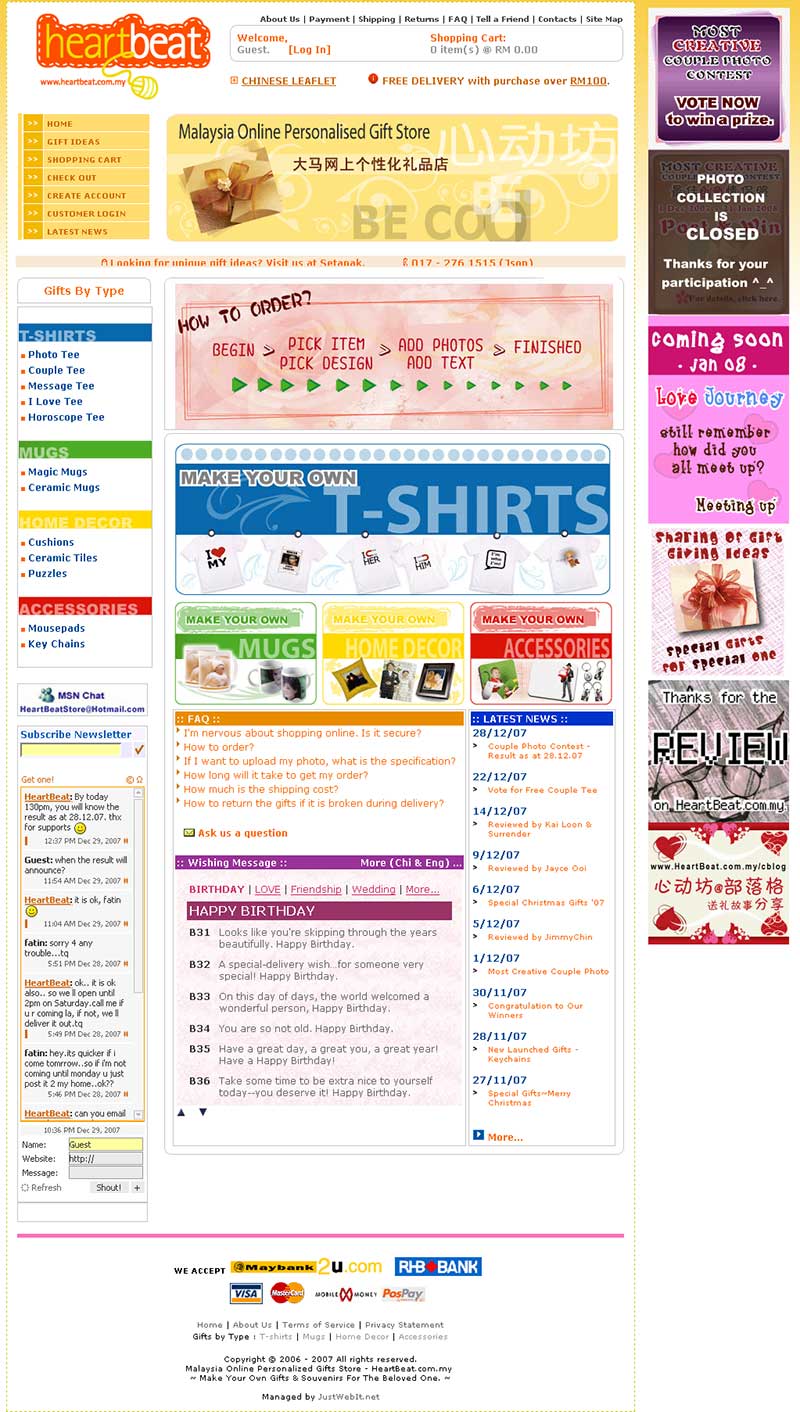 If there’s one thing Malaysia e-commerce websites have in common is clutter. All of the owners have this thinking, if the user doesn’t see what’s upfront then they will not know what products they offer. Well, news flash to Malaysia e-commerce website owners is users are not stupid anymore. They know how to navigate your website (or pretend to know) and they will try to find their goal until they give up on you. And this is not a good thing.
Currently, 90% of the Heartbeat website homepage is actually covered with banners. Plus, there’s a moving headline sliding from left to right telling people to visit their physical store with a contact number. Which brings me to only one question when you’re on the homepage, where am I suppose to start?
- Flash banner (oops, not clickable so this isn’t right)
- Sliding headline (not interested in contacting you)
- ‘How to Order’ banner (I don’t understand as it switches too fast)
- ‘Make your own’ banners (Ahh, this is helpful – I start here)
- FAQ (no point reading since I’m looking for a product)
- Latest news (not interested since I’m already looking for my product)
- Wishing message (no idea what’s this so why bother about it?)
This is a scenario of an interested buyer who is looking to order an item from your online shop. And clearly, what I’m interested in as the buyer is one of your four main categories; t-shirts, mugs, home decor or accessories. Proving the rest of the banners or additional elements on the homepage are pretty much under utilized.
The ultimate strength of the Heartbeat Malaysia online shop for personalized gifts now is after you navigate away from the homepage. Once you’ve selected an individual product, you’re pretty much presented with options on how you’d like to personalize or customize the gift. All you need to do is select one of the templates and you’re on your way.
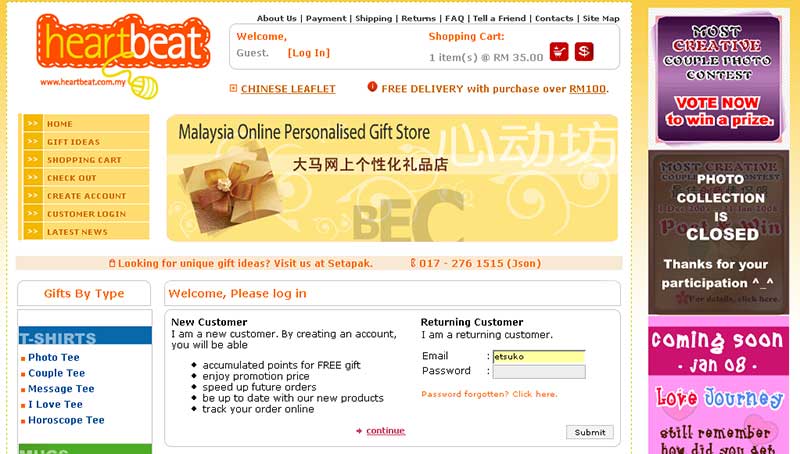 Like any other e-commerce website, after you’ve customized your gift you’re opted to register an account to make your payment. The obvious weakness to me here is the layout to register as a new customer. When you’re prompted with either to register a new account or sign in, the button to continue to register a new account is confusing. Why it’s confusing? It’s in the center of the ‘box’ and it unconsciously connects the new account and returning customer. There’s no line to define its border.
The checkout process was pain free including selection of shipment method or payment method. By the end of the process, I was presented with information detailing my order and payment to be made. There was even a print function alas it didn’t come up to my expectation. I thought I would only be printing out the important details without including the website. In addition, I personally find the font size a little small for the average user – unless you wear glasses.
Overall, the Heartbeat Malaysia online shop for personalized gifts has a number of weaknesses to strengthen. But its current strengths are what is enabling it to continue standing right now. If I were to work with Heartbeat, these are the things I’d recommend:
- Redesign the homepage
- Remove unnecessary banners, distractions and navigation
- Reorganize the navigation
- Remove redundant navigation
- Increase the font size (minimum 12px)
- Reposition ‘Subscribe to newsletter’
- Make the e-commerce website browser compliant (Not have; ‘Facing problem uploading your photos? Please try Internet Explorer or MYIE. Sorry for inconveniences caused.‘)
An e-commerce website today doesn’t survive on making just an impression but delivering a healthy shopping experience. After all, who loves to go through every aisle having to just search for batteries?
[tags]Heartbeat, e-commerce Malaysia, online shop, personalized gifts[/tags]
Just wanna wish you a happy new year!
Great review! This is a free or paid review?
syed:
Thanks and happy 2008 to you too! :)
dicky:
It was done free albeit upon request.
Great review, Danny! The site has some genuinely attractive products but it isn’t as geared to selling them as it could be. It’s just too busy and crowded with banners and it lacks the motivating factors that make it easier to convert people from visitors to buyers.
Thanks Suffian. I’m sure their directors would consider the review above and take their future redesign seriously. :)
Yup. Review is all about strengths and weaknesses. Therefore, the one I have is also not a review but a write-up. At least I have done my part, introduce people about HeartBeat.com.my. I think that is what Vincent want. :D
Well, Vincent was confused between the write-up and a review when he first contacted me. But I explained to him the difference and showed him my Tumpang website review. At least now he knows a website review does really help improve the website and not only generates awareness.
Though I have to admit, a review can be a like a double-edged blade. :)
hye…..can u give me 3 e-commerce website that i can critic them….???its must content their organization,colours and their function……..
raina:
At the moment, I’ve got no other websites to review. Simple reason is no one likes their weaknesses pointed out openly.
But I can suggest you to email the websites you found and inform them you want to review their website.