Dustyhawk aka Serge aka Leo aka multi personality blogger emailed to request a review and suggestions for his blog. I’ve only met Dustyhawk once in person I think and that was during the last blogger meeting at Midvalley on one fine day.
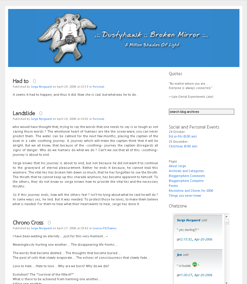
Anyway, taking a look at Dustyhawk’s blog, you’re greeted firstly by the character found in the web comic Megatokyo though forgot the name of the hamster. Dustyhawk’s blog is like your average personal journal type blog. He blogs anything and everything that comes to his mind.
 I think if anyone were to read this blog, they’d need to get comfortable with the blogging style of Dustyhawk. He’s got this multi personality (some might call it weird) style of writing posts that sometimes you wonder if this is all really from just one blogger alone. Don’t expect me to comment much about the copy cause I’ve not much of an English whiz.
From this point, I’m going to start reviewing elements that are of my own preference and to what I’ve learnt about usability and behaviours of people online. Reason I’m saying this is because due to the blog being a personal journal, it’s personalisation is heavily dependent on the author itself. So carrying on.
The text on his blog looks like it’s still stuck with an old 11px and that kinda disturbs me. Though most of his posting aren’t long winded, the number of parapgrahs compared to lines of text sometimes confuse me. I’d try increasing the size of the text because legibility of reading is one of the main concerns today.
The layout of the blog is really bland. There’s no real seperation of the content and the sidebar other than the average gutter size. Each section on the sidebar is only seperated by the header text that doesn’t exactly do much of a good job. One of the hardest things to do on a blog or any website today, is eliminating the unnecessary clutter.
I’m not talking about ads but things like Last 10 Tunes listened, Desktop, Blogrolls, and the tons of mini buttons. How many readers on your blog would really be interested in these things?
The other thing that should be questioned is the search box. Does every website user know they should hit the Enter key to activate the search? The assumption of this just doesn’t fulfill the expectation of every website user.
So far this is the only blog that I’ve come across with a continuous profile page. In addition to that, there’s a section to learn a few things you didn’t know about Dustyhawk.
Now to be honest. Reviewing a personal journal type blog is very very difficult because as I said earlier, the blog has been accomodated to the personality of the blog owner. The theme, the content, the style of the whole blog has been deemed satisfying to the blog owner alone and not the average website user.
Therefore, all I can advice Dustyhawk aka Serge aka Leo for his blog is:
- Filter out the unnecessary things to be shown.
- Increase the text size a notch.
- Use a larger text size, color or bottom border to segment out each section on the sidebar better.
- Place a Go or Search button on the search form.
- Optimize the placement of your Adsense instead of just putting one on sidebar there. Try a 468 x 60 or 300 x 250 in the single post areas.
Well, that’s about what I can say about your blog.
Here’s a little advice to anyone who wants their personal journal type blog reviewed in future. If you have a blog only designed and catered to yourself and you can’t handle comments or feedback, just keep the blog to yourself in the first place.
thanks for the review dude.
Hello, its a great review there. Do you think you can review mine too? :D
http://www.whats-this-then.com
Pennywise
Serge:
Welcome. :) And your trackback left a JS comment before I edited it. Weird.
Pennywise:
I’ll see if I can do it tomorrow. ;)
it did ? strange…