Gong Xi Fa Cai or happy Chinese new year to everyone celebrating it this year. To Norman who lost a close relative, my condolences and I hope your life will nonetheless continue to prosper as the year of the Fire Pig brings much wealth and luck this year. Now we’ve got the greetings and holiday mood easing off, I’d like to share my 10 tips to test your web design.
I’m writing this entry out of inspiration and felt the need of it after following the Low Yat forum thread by moujo. Like any other web designer or developer, he wanted feedback on his website. He got valuable comments but the direction of the test wasn’t heading anywhere so I hope these tips would assist others in future.
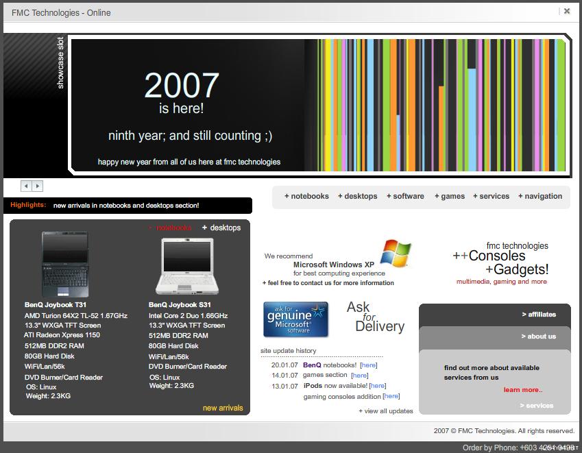 When moujo started his discussion, he did with a lot of optimism and enthusiasm looking forward to improve the quality of web design. He was looking to enhance and improve the website FMC Technologies Sdn Bhd even more from his team came up with it. Click on the thumbnail to view a larger version of the homepage.
1. Find your Website Goal
I noticed many web designers, developers or clients don’t ask this very important question. Their intention might be to use the website as brochure ware but they didn’t take the time to appoint a short term or long term goal. We need to stop thinking along of the ‘build and they will come’ mentality used 5 years ago.
Start thinking why your website is being built. What is your website suppose to do. How is your website suppose to help increase business. And lastly, what is the goal you’re aiming to reach?
2. Know your Audience or Users
This question comes naturally aligned with your goal. The audience or users to your website will help reach and accomplish the goal you would have set for your website. Without alignment of the 2 criteria, your website wouldn’t be able to realize its potential and end up in disaster.
So who is your website intended for? who are the users using your website? who are the customers that will purchase from your website?
3. Understand basic Color Theory
A lecturer in Melbourne, RMIT once shared with me not everyone is a trained designer. He said everyone can design not everyone understands design. Colors are suppose to be a designers strong point. Creating a harmonious or dark gloomy atmosphere using colors is a designers ability to create emotion on your website using colors. Therefore, professional designers understand how to bring out your products or brand using correct color theory.
Bad color contrast can affect the user and the web experience in your website. Not to mention it can hurt the eyes of your users. For example; a lime green background and white text.
4. Use a suitable Layout or Grid
The layout is important in web design to seek balance as a whole. A weak house foundation is useless against the heavy roof you’re placing on top. The arrangement of sections in your website can help you generate a sale or make it just plain website. The space you allocate for your hit product creates the focus leading the users attention to it.
A great layout makes an impression. A good layout feels comfortable. An average layout feels like any other website. A lousy layout will scream out itself.
5. Start your own Brand
Many are doing this unconsciously. Even bloggers with personal journals do it. It’s just they don’t realize it. When building a corporate website, it’s important your company name is located in a prominent location without distractions. It should stand on its own and my personal preference is to always place it on the top left corner – prominent, strong, recognizable the moment you visit the website.
Find out more about building a brand for yourself; find your own brand.
6. Guide the Users Eye
A good layout, beautiful colors, smartly crafted and planned content can give your users a free tour around the webpage without you realizing. One of the question I’ve asked some of my friends when I show them my web design is; What’s the first thing you see when you viewed the design? What follows after that and that?
Planning the path of sight isn’t easy and requires the understanding of color, layout and the goal of the website. Eye tracking is part of usability testing to study the behavior of users as they try to use your web design or website before going public.
7. Practicality and Web Design
Like how fashion changes, web trends change and there are followers. Some believe if they don’t follow they get left behind. Some follow blindly enough to ignore the thinking of practicality of using it in their web design. I like simplicity and practicality never does come easy because it’s about taking away unnecessary things – sometimes eye candy.
If you’re using Flash on your website, what benefits has it brought to your business or sales? Or is it merely a feature now residing on your company website? Is Flash making you lose foresight?
8. Have an Ease of Use policy
Building a website takes more than astounding aesthetics and what we’ve been discussing above. The Internet users today demand a website equally aesthetic and user-friendly. They’re tired of having to look for the login panel. Tired of ending up in a webpage, reading all the marketing content and not being able to find the information they’re looking for. Ladies and gentlemen, usability started before Web 2.0. It was always there but never given enough attention.
If your customer wants to find a shoe with a pink flower at the tip, let them find it and buy it. Don’t show them shoes with other colored flowers before the pink flower. Shopping cart abandonment is due to non-streamlined process in e-commerce or the added difficulty of purchasing from a vendor. If your customer can’t find a company location map, give them a hand of how they could get one.
9. Content is still King
There isn’t much to say here. Content is still king in a website today. The right content with the right tone is the online salesperson you’ve left in charge of your responsible during breakfast, lunch hour and dinner time. The content on your website is what will help you sell your products and services. If your customer can’t understand it, you’ll get weak requests and worst case be misunderstood for offering other services.
Here’s something you might not know. There’s a difference between an offline and online copywriter. Copywriters who churn out articles for the web understand the Internet language and tone used. They understand and know the phrases to catch your customers or users wandering attention on your website. So that’s why some say even with a bad layout, your copy may still merely save your life.
10. Ask
Simple and straight forward. If you don’t ask others for feedback or constructive comment, you’ll never find a valuable answer. With forums and blogs, it’s very easy to get answers. Some might praise while others might hurt you but in order to achieve near perfection, you need to accept the answers of many to realize your weaknesses.
An added tip when asking. Never lose optimism and allow the negativity to affect your goal you’ve set to achieve.
m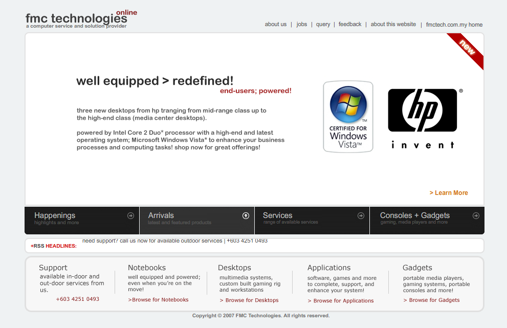 oujo who accepted all of it and other comments in expose, be open to critics, and evolveÂÂâ„¢ understood this and emerged with great results. He’s managed to keep a level head and improved the initial design with confidence with the help of others. The current final web design is near perfect and has very little left to improve on this version.
I hope you’ve found my 10 tips helpful if not informative. If you’d like us to perform a full website audit for your company, please use the contact us form and we’ll be in touch with you when we resume business on Monday (26 February 2007).
[tags]Web design, User experience, Website goal, Usability, Web design tips[/tags]