Before I head off to bed, I’d like to leave my dear readers and visitors with a small quiz. I’m sorry to say there are no prizes to be given away – maybe in future. However, reason I’m doing this is to see if you can spot a similarity I’ll continue to discuss on tomorrow when I resume this entry.
So let’s get started. Spot the similarty between these 2 different websites; Happy Cog and The Blog Studio. Below are the screenshots if you don’t feel like visiting them.
Please subscribe to my comments after you’ve guessed to instantly find out when I’ve updated this post.
Content at this point was added on 21 March 2007.
I’m pretty sad of the feedback I got except for ol Mossie down there. But I guess I’m partially to blame since I don’t update this weblog very often and I’m sorry if I don’t do weird poses or talk about parodies in my life much. But enough with the disappointments – let’s back on track here.
So what was the similarity I found between the two established web design and development companies above?
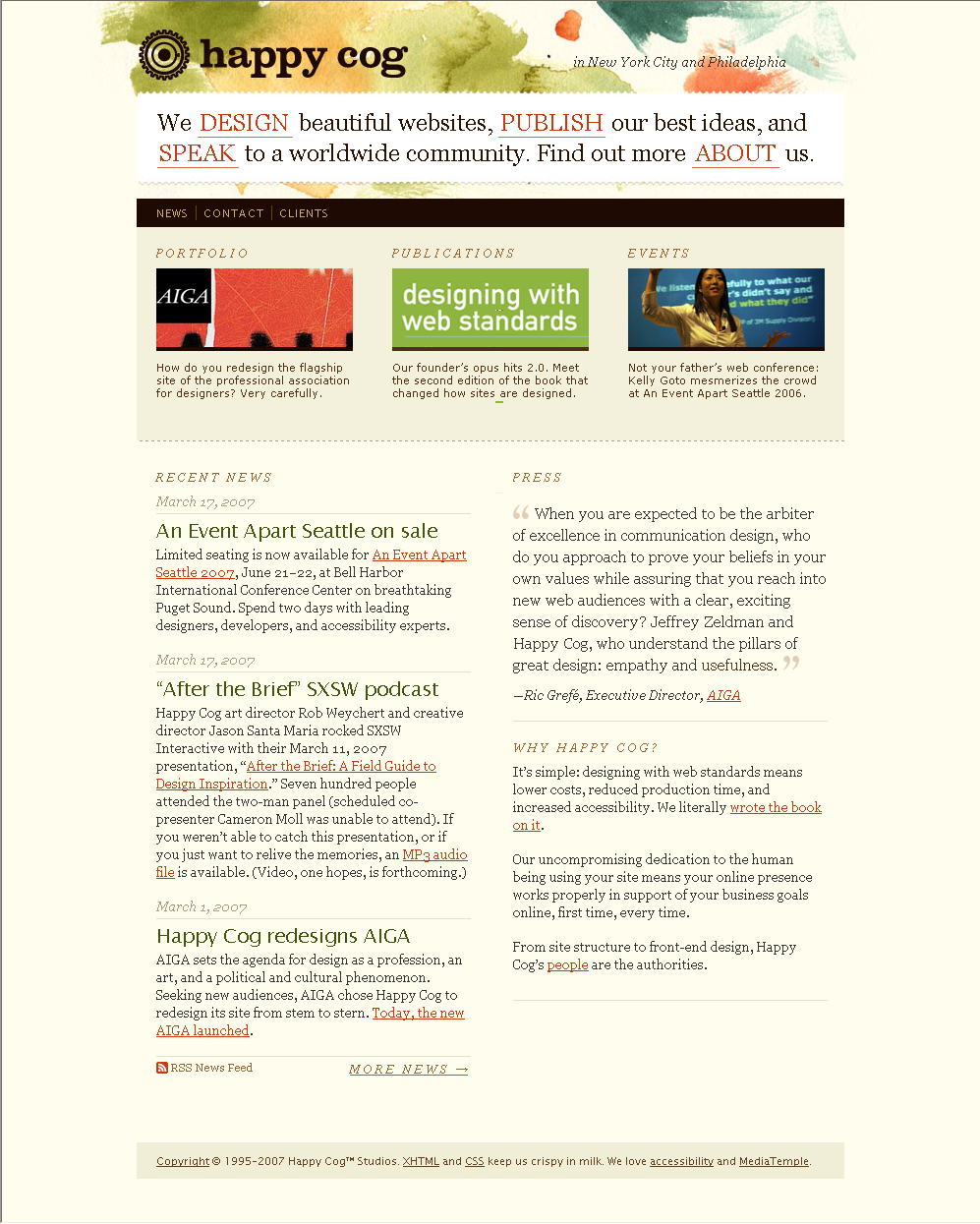
If you took notice of their header area, they are using a very similar approach. Still haven’t caught it yet? It’s the part where Happy Cog says,
We design beautiful websites, publish our best ideas, and speak to a worldwide community. Find out more about us.
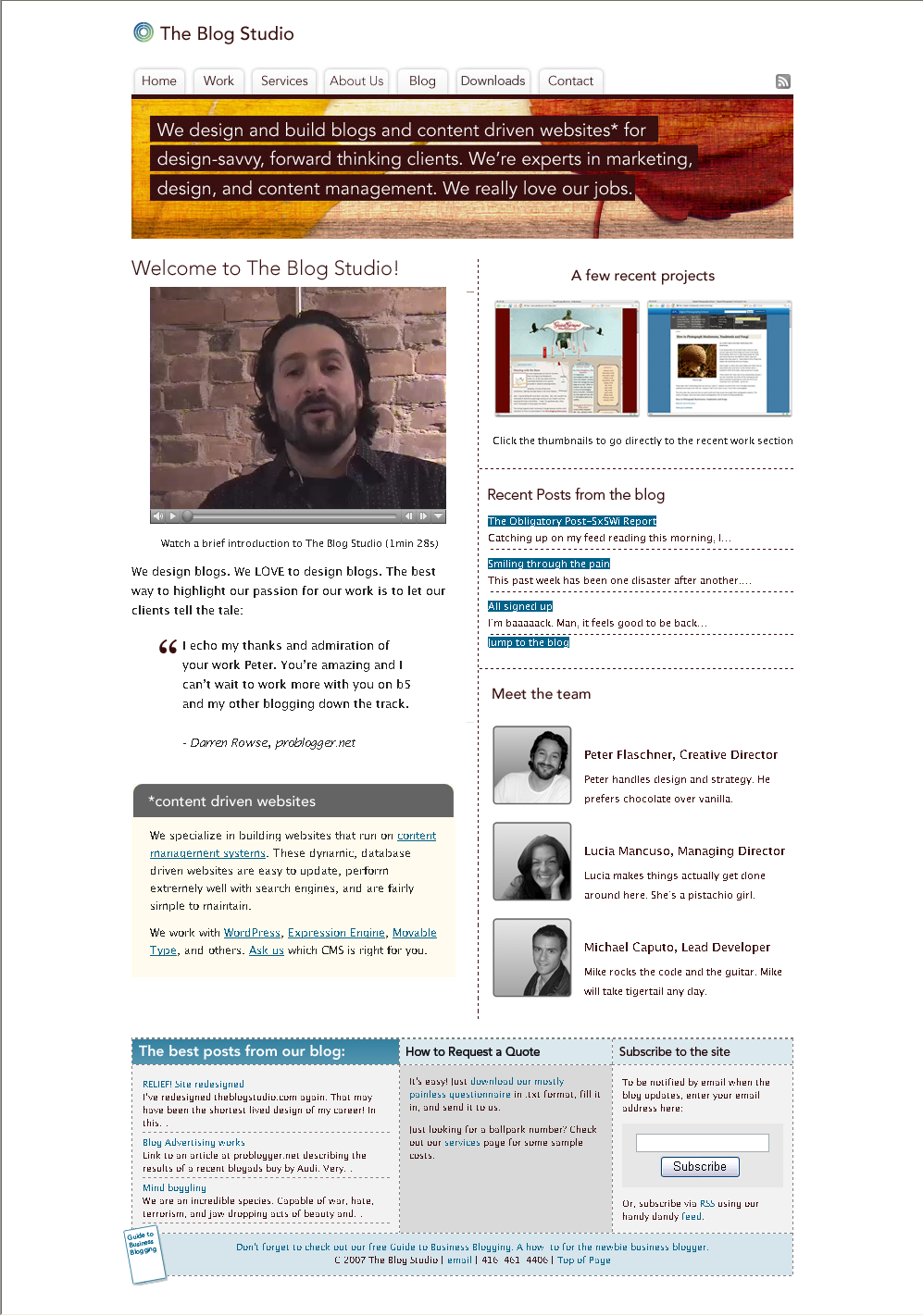
and The Blog Studio says,
We design and build blogs and content driven websites* for design-savvy, forward thinking clients. We’re experts in marketing, design, and content management. We really love our jobs.
Yup, that’s the similarity I’d like to talk about in this entry because like any trend this is a sign that soon other web standard designers will be getting their inspiration from. When I came across this strong header message, it was firstly done by Happy Cog who did a spectacular job redesigning their website.
I found it surprising when I visited The Blog Studio again (after awhile) and straight away noticed the similarity. There was actually another website I’ve come across with the similarity but I couldn’t find it or we’d have a quiz to find the similarity between 3 websites.
If you’re asking, what’s so great about having a strong header message as used by them?
It communicates with the need of your customer the moment they visit your website. It’s like ‘smack in your face’ saying “we are a web design company and we produce really great stuff so why not find out more?”.
Most websites today use the “Who We Are”, “What We Do” and others on their homepage to introduce themselves to visitors the moment they visit the homepage. However, it doesn’t really work as well as this because it’s simpler.
It uses less eye tracking and it’s the first thing you will read on the website. The difficulty of pulling this off is getting the copy right while not being seen as an agency that doesn’t produce quality work.
Well, I hope you enjoyed the quiz and found something informative out of all of this.
Would you like me to have more quizzes like this in my blog?
mmm… need some time to think about it… obviously answering that the layout is almost identical does not suffix! get back to you! :P
Hey Mossie,
Thanks for taking interest in this. :)
ah… i see i see… it’s definitely something new and not so common yet… but the two messages did caught my attention!!! maybe i should do this to my blog and say
“THIS IS MY BLOG! I DO WHATEVER I LIKE HERE!”
hahaha!
Well, it is your blog after all.
I wonder what mine would be then. LOL!
its getting old already..
and btw, i strongly believe that happycog isn’t the first.. there are LOTS of websites before them that use this kind of communication technique..
Hey Ikram, thanks for dropping by.
It would’ve been great if you could’ve shared one of the memorable websites you saw which used this method of communication.
But thanks for sharing a comment now and then.
here are some, may it be before or after new happycog was launched..
http://www.electricpulp.com/
http://coffinboy.se/
http://freshview.com/
http://www.al3x.net/