Why you clicking on the Refresh button on the Project Petaling Street website? The update ain’t there yet. It’s right over here.
Yes, bring your blogger behind over here so you could have a look at the prototype that will be replacing the old look of the current Google theme. No more will you need to get used to that layout because we are going back into time when it was 2 columns.
Just that now, things are a little more organized and I dare say, better organized than it ever has been. So come on in!
The big project started of with just a simple call for help; PPS NEEDS YOU! and I appreciate the bloggers who did lend a voice. Then after 2 days, I worked my butt of making head or tail of the comments along with my own self analysis; PPS Analysis Review.
After all that research was done, it was time to get a little messy and come up with a site skeleton that was going to be the future of PPS in a very short time. I posted the PPS Site Skeleton just after a day of analysis trying to come up with something of a balance for all bloggers. Then later on, I found out the PPS Design Leaked out into the public with my knowledge. I’m telling you, the culprit is still at large.
So finally with the help of a new and good friend; Chee Aun, who is the CSS guru of Malaysia (for me), we present to you the new pps homepage prototype.
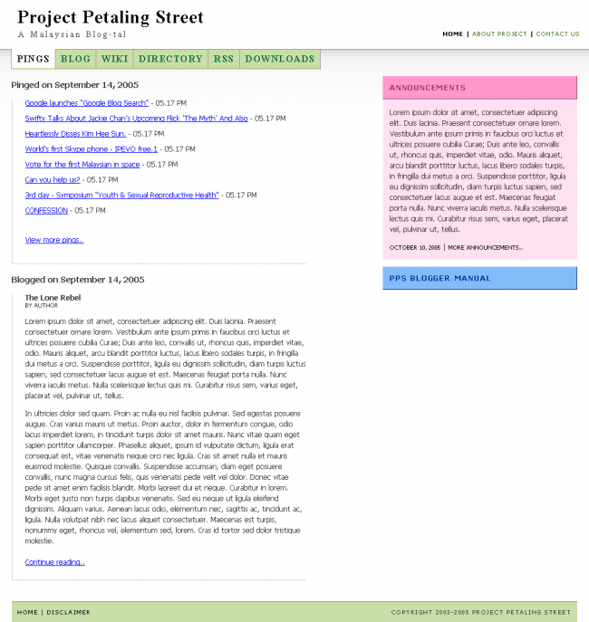
Links aren’t working as of yet but I’d like to highlight a few technical agendas which I’m very proud of Chee Aun to implement.
First of all, he helped implement an accessible show / hide panel located on the sidebar. The panels you see on the right are collapsible and yes, the colors might change to some other web safe color later.
The next hoo-ha you should all note is that..okie okie..this is just so cool so I don’t want to spoil it for you. What you do is click that button beside the ‘X’ aka Close Window button. Then you resize the window into a smaller screen. Do you notice the coolness?
Now, isn’t that cool for you?! Well, it definetely is for me and Chee Aun is the man! I’ll be working with him through this project and you can bet that we’re expecting more magic later on when we’re done with the other services.
I actually should’ve contacted Aizuddin first about the prototype going live but hey, this is a community project.
Whether cheer or boo it doesn’t matter but please tell us why. Thanks.
Er.. what X and resize? You mean the design is fluid? Very nice
Btw, cheeaun has killer color instincts. How I wish I had his eye for color matching
Hi Danny,
Sorry if this has been answered before, but is there any plans to archive PPS pings by date and category? I mean, for now as soon as it’s off the ping list, then it’s gone forever, right?
Btw, nice look and feel.
Cheers!
wow… this is *much* nicer than the current PPS website… good job!
hahah… truth is, i’ve begun to fall in love with the current layout at http://www.petalingstreet.org/pings.html
however, i would prefer the ping page as the default page. no need to click and click…
and the resident bloggers are still missing… :/
sweeet :)
The design is very fluid :D
Chee Aun is a master. Respect.
Anyway, are your implementations purely DHTML and Javascript? Or are there server-client interactions going about behind the scenes (eg AJAX)?
PS: How’d you compress the grey-to-white PNG gradient to be so small? My PNG files are unusually large, no matter how hard I try to compress them. What design tools do you use?
The green you used for the background color of the navigation looked dull on my Mac… but is ok in Windows RGB … maybe a minor change there is possible?
On other subject, i suggest that you should increase the leading in this website a bit.. your post looked crammed.. just my personal opinion.. hehehe..
I love the re-sizing thingy.
Wow! Lots of comments. Very big thank you.
@totoro
Sashi actually kinda told me the same thing when I met him. I told him that we’ll try implementing that if list goes behind, then you navigate by Page numbers like what you see in some WordPress blogs.
@apcc
If we made the pings page the homepage like the old PPS, would you visit the other services at least once a day? or know that it exists? I’ll see what I can do with the resident bloggers later.
@wzafran
*grin* All technical questions regarding CSS development can be directed to Chee Aun at http://cheeaun.phoenity.com/weblog/
@Hafiz
What green would you be suggesting? Please share the hex value and I’ll tweak the CSS. If possible, please suggest a web safe color. And which post you refering to increase the leading? The blog excerpt? The side panels?
Anyway, so that everyone knows, we have no server-side developer for this project. The only volunteers are me and Chee Aun. Both of us aren’t server-side developers.
So if you’d like to lend a hand in this, do lemme know: me at dannyfoo dot com.
Just a small comment… the tabs at the top of the page, maybe you want to change to a san serif font to match the rest of the page? i know the PPS title head is serif, but it doesn’t go with the rest of the text…
very promising, danny & chee aun…
Chewxy,
The colors for the prototype I simply follow what Danny gave me :-)
Wan Zafran,
The prototype doesn’t include any ‘cool’ stuff like AJAX (yet?). I need time to learn that. And if you google, you can find few software that can optimize PNG files.
Hafiz,
isn’t Mac have different gamma settings than Windows?
Thanks for comments dudes. Enjoy.
@Simon
The tabs actually are using the same font of the PPS title; Times New Roman. Just that they are in capital. :)
I have some comments regarding the prototype:
You dont need such a big space for announcements which take up almost one third of the page.
Secondly is that if you don’t tell me the right panel is collapsible, i don’t even know it works like that. So i suggest use a [+] so that people know that it is collapsible instead of clicking the title link.
Btw where is the “coolness” ‘X’ aka Close Window button you mentioned?
Again what i think is that the page is very big so don’t waste it.
Chee Aun you rocks man hehe, have to give you props on the design. Btw where our yum cha session go liao lol :)
Very nice fellas, good work. I’m not really big into multi-colours (pink = urgh!!!), but i’m willing to give it a shot. I can imagine the navigation and its looks a lot smoother than the current PPS.
Just a note: The launch of the new design will coincide with upgrading PPS to Movabletype 3.2 — can we make the new design StyleCatcher compatible?
The plan: right off-the-bat, PPS, PPS Blog and PPS RSS will be moved to MT3.2. The designs for the WIKI and Directory will need be changed manually to match all the rest.
Perhaps you can use this:
http://styles.movalog.com/generator/
The design of the side panel was meant to take at least 1/3 of the side. Why? Well, have you ever measured the length of the average announcements in the current PPS?
There was suppose to be show/hide text there but think Chee Aun has something else in mind. I’ll let him handle that. :)
As for the button beside the X aka Close Window, called the Restore Window/Down. After clicking on that, try resizing the window to a very much smaller size and you’ll understand what’s so cool about the design.
If you still don’t get it, I quote Hawk’s comment, “The design is very fluid.”
@Aizuddin
Hehe..we might make the annoucements green/blue instead. As for making it StyleCatcher compatible, we could make the Blog and RSS compatible I suppose. But for the homepage..maybe.
Reason is cause I’d require CheeAun to have a look at this first hand. I myself am getting use to MTs new markup and they’ve not released all the stripped templates yet.
We’ll try our best anyway. :)
Cheers.
but i think it looks better if the tab follow the body text font, not the title font…
Danny, about the leading, i meant the leading in posts in this weblog ( your personal website ) sorry for the off topic remark.
Suggestion for a new green? don’t know, maybe #aaff88 or #aaff77 ? Though you can keep the current color as it is.. not many ppl uses Mac anyway.. and it’s just a small issue.
You might as well give the links of the ping list some CSS love by changing the color to anything other than the standard blue… hehehe..
Chee Aun, yes.. Mac RGB and gamma setting is different from Windows, that’s why the green was a bit dull on Mac, but ok on Windows.
Aizuddin,
Whatever the MT changes, adapting the CSS is not a problem at all. The problem now is why use MT? I prefer PHP…
No problem. We’ll help the current and new PPS. As it’s helps us too. Looking forward to the new PPS. Good luck everyone!