It was months ago Maybank2u conducted their first ever web design contest. The web design contest was aimed at its current savings account holders. It was started mainly to generate the awareness of its new Malaysia teen financial banking portal; myzone.
At the time, I thought why not join the web design contest since I’ve not participated in any. Plus, there was a cool new computer to be won in this contest. However, the main prize soon wasn’t my main goal after I managed enough funds to build my new rig. Nonetheless, like any website design project I undertake I gave it my full attention and commitment.
Sadly, I wasn’t one of the selected Maybank2u myzone web design finalist. :(
Usually, it’s at this point you’d assume I’m going to bitch about the organizers or the other finalists since I didn’t get in. Well, that would’ve been the case if I were 12. Instead I’d like to share my opinion and give constructive criticism about the finalists the Maybank2u folks selected from the many entries.
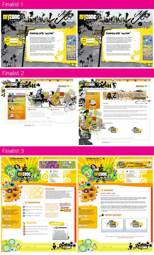
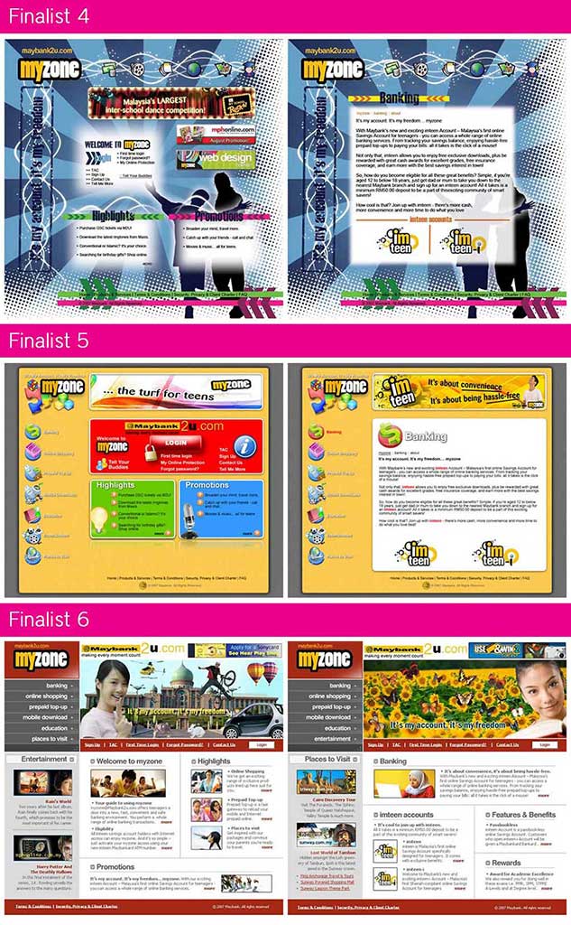
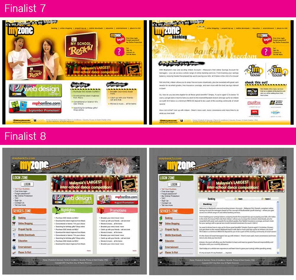
The finalists above are arranged in the order from 1-3, 4-6 and 7-8. Now, if I were to judge the winning website design based on its visual appeal I would select finalist #2. It’s design concept is aimed highly at teenagers, very rebellious, very trendy as I would put it. On the other hand, if I were to select one of the above based on its proposed user experience I’d go with finalist #5. Boring, but very usable from a user’s perspective.
The shortlisted website designs use concepts ranging from hip and trendy, grunge, commercial or corporate, simple and sophisticated. All of them has its potential if it were used on myzone but all of it has a large downfall as well. Its weakness derive from balance between conceptual design, user experience and more importantly, development process.
Conceptual design is always executed well by any experienced designer. User experience is ignored all the time in Malaysia because many are just arrogant. As for the development process, put it this way – programming standards does not equal design concepts. In website design today, there should always be a balance between these three elements.
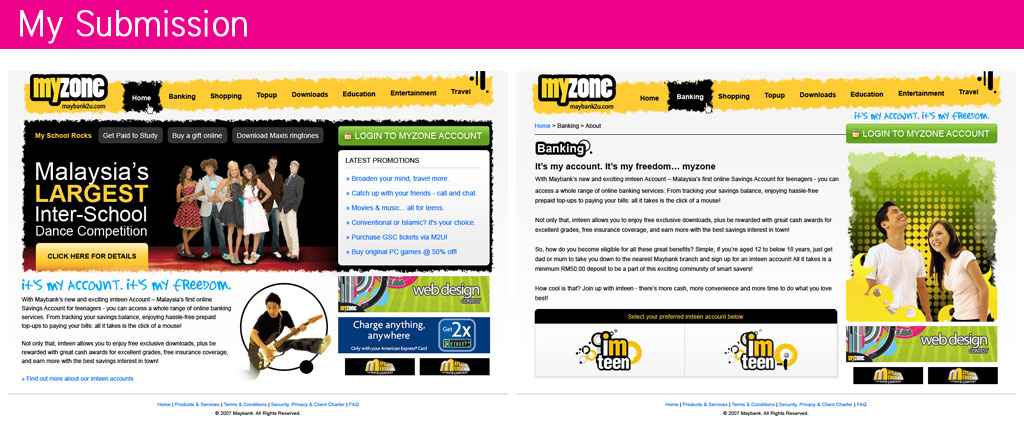 My website design has evolved through the years from futuristic to now clean Web 2.0 (as many may call it) design. Now I focus more on the user experience and the development process before the conceptual design. By knowing how a developer works, I create a harmonious connection between them that eventually creates a website with a fulfilling user experience. Don’t get it?
Web 2.0 to me is about enhancing the user experience. It’s providing a website to fulfill the main goals of the user and to ensure they’d return for another experience. Whenever I write a rationale for my website design now, it’s from the stand point of a user and not as the website owner or designer. For my maybank2u myzone submission, I actually created a rationale and an excerpt from it was…
You may have noticed the menu does not follow the current Maybank2u MYZONE website. The icons were removed because it created a childish environment rather than an environment targeted to most young teenagers to date.
Download and read my full [download#2]
Well, all the best to the shortlisted maybank2u myzone entries. If you’ve any comments of your own on my maybank2u myzone submission please feel free to leave them in the comments below.
[tags]Maybank2u, myzone, financial portal, website design contest[/tags]
Your submission looks really good too.
Thanks, Kong.
Now I’m just waiting to see who won it and if it wasn’t finalist #2 I’d say this contest was very controversial. Especially if the organizers will not share why they selected that particular winner later.
Seriously IMO your design is way better than those finalists. Clean layout, well planned grid structure, big buttons, good site flow..
I really dunno how they judge the submissions, some finalists designs are so old school! Design 6 looks like a rip from Template Monster’s template, others are too cluttered with “oh so fancy and youth” graphics.
I think you should put some faded yellow color stripes (for example) at the background , maybe will look more livelier and capture the judges eyes.
Sad for you for din make it into the finalist, but i think urs definitely deserve to be one of them. But if is me, i will pick design 3.
(btw, when i hit “,” or “.” it keeps popping out the lightbox)
Thanks for that, jayhan. :)
And yup, I also noticed the Template Monster like finalist in there. *grin*
Well, we both selected the same person but let’s see if that person will have it’s fair vote and support from the community as well as the judges if they have a say in this.
On another note, I’ve deactivated my thickbox plugin. I was using Lightbox at first but I think after editing the template files, I’ve made this theme incompatible with Lightbox/Thickbox for some reason. Guess that means I’ll have to come up with my own layout. :P